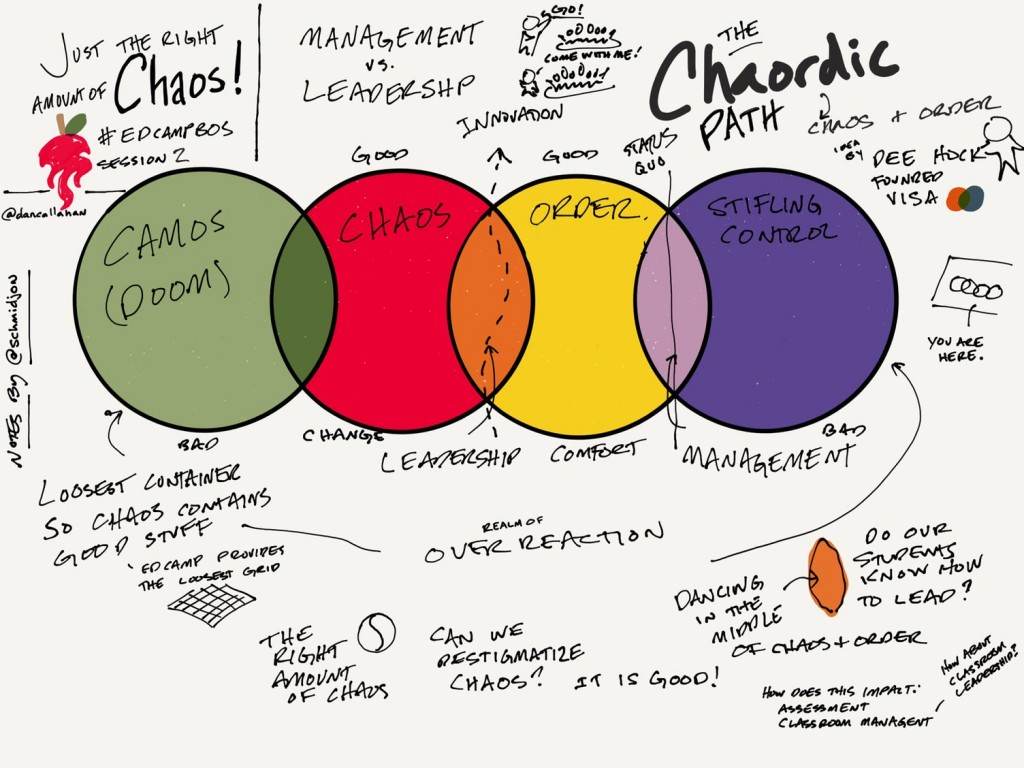
Since I went to EdCamp Boston a bit ago, I’ve found myself thinking about the session Dan Callahan led about the Chaordic Path. It was a great session, and the Chaordic Path idea slipped nicely into my existing structure of understanding of learning spaces.
My issue (or, rather less judgmentally, my thought…) is more centered around the graphic commonly associated with that idea.

There are a bunch of topics that I’ve spent time dealing with in classrooms over the years (mostly in regards to themes in literature) that students have struggled with, and many of those themes seem to have the same thing in common: they occupy a spectrum. Or, if you’d rather, a continuum. Things like “Good vs Evil” or “Light vs Dark” or “Male vs Female” come up over and over, and while student at first gravitate towards them, as the inherent complexity becomes more clear, they find themselves struggling with the ideas. What they want initially is a nice binary choice: things are either good or evil (but not both). It’s ok if a character switches from good to evil, but students want to treat that like a switch- one moment they’re good, the next and they’re evil.
But that’s not human reality- people (fictional or otherwise) are rarely wholly good or wholly evil. More often they’re complicated mixes of the two that vary both based on the time but also based on your perspective as an observer. And so: we find ourselves trying to explain continuums. They are, of course, familiar with a number line, but they are not used to applying that sort of model to other aspects of human life. Gender. Sexuality. Order and Chaos. Good and Evil. Light and Dark.
We want to represent the complexities of life as simply as we can- that’s part of the efficient transmission of information. But we must learn to be careful in classrooms to not adopt such simplified models that we loose the inherent meaning imparted by the continuum. Instead of allowing binary choices to abound, it’s time to start showing students that most of what they think of as binary simply isn’t, and to treat is as such is reductive. It is a cheat- to reduce something complex to an overly simple model allows flawed thinking and cognitive fallacy.
It’s ok for things to be complicated. It’s ok for there not to be easy answers to seemingly simple questions. And it’s ok for our answers to change based on when/where/how/who is doing the asking (and for the questioner’s perspective of our answers to shift, too).
Asking a student if a character is good or bad is a fine start, but by broaching the idea of there being a full spectrum of good vs bad (and that a given character’s position on that spectrum might not be a simple thing to answer) allows students safe ways to begin to understand that complexity.
Dan’s presentation of the Chaordic Path was very good (clearly, as I’m still thinking of it several days later…), but it’s the graphic I want to address. The interlocked rings are a good start (and, for the purposes of the session, likely the right choice). But I find myself thinking that a line- a simple line representing the spectrum of spaces between Camos and Stifling Order does a good job of illustrating both that these gradations exist, but also that an environment can easily slip between these areas over the course of a lesson or day. In my mind, it’s a spectrum with “sweet spots” on it where especially useful conditions seem to exist.
